DE
Insights Media Careers
Contact
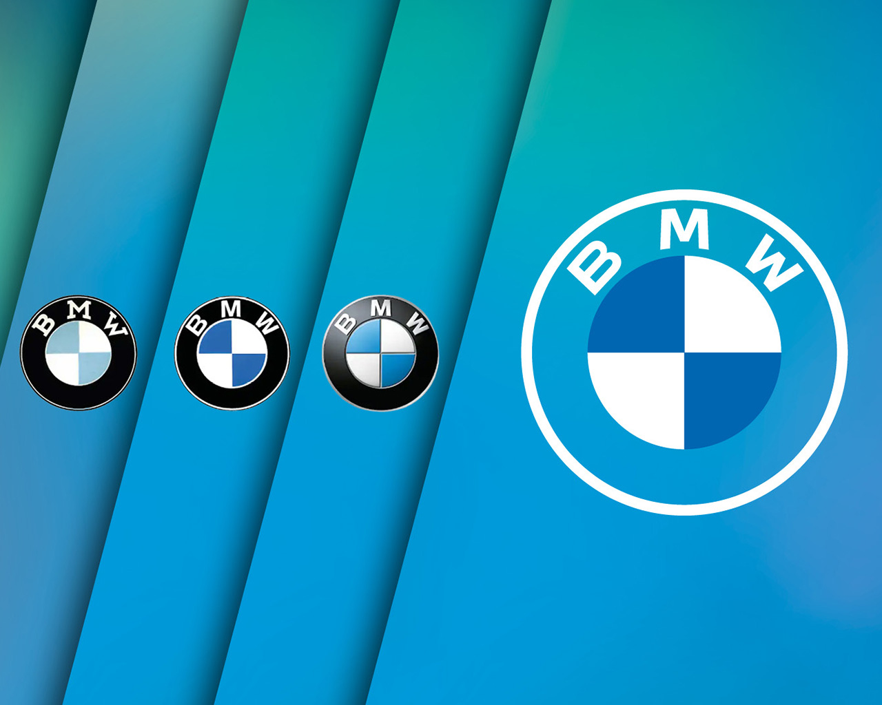
Graphic showing the evolution of the BMW logo: from left to right, the emblems from 1917, 1933, 1953, 1963, 1997 and 2020 are shown against a diagonally striped blue-and-teal background. The changing typefaces, colours and designs are clearly visible. On the right-hand side, shown in a somewhat larger size, is the transparent communications logo, which omits the black ring.
Company 16.11.2026 6 MIN

The BMW logo: History, meaning and the propeller myth.

A circle, three letters, four quarter-discs in blue and white: the BMW logo is a symbol the world over and instantly recognisable.

In 2026 the BMW Group celebrates its 110th anniversary. Its logo is almost as old. We explore its history and meaning, from the Rapp emblem of 1917, via the propeller myth, to the transparent communications logo used today.

What many people see in the BMW logo – and what’s actually there.

So, what does the BMW logo represent? A rotating propeller against a blue sky, perhaps? That’s what a lot of people think when they see it, an enduring interpretation that’s not entirely random. The real origin of the logo, however, is much more down-to-earth, rooted in Munich and the Free State of Bavaria – the home of the BMW Group.

Why the BMW Group celebrates 1916 as its founding year.

To understand the BMW logo, you first need to understand the company’s history. Although 7 March 1916 is regarded as the company’s official founding date, BMW – officially the Bayerische Motoren Werke GmbH – wasn’t actually established until 1917. Here’s why.

On 7 March 1916, at the request of the government, the aircraft manufacturer Flugmaschinen Gustav Otto was reorganised and renamed the Bayerische Flugzeug-Werke (BFW). One year later, Karl Rapp’s engine company, Rapp Motorenwerke, was also renamed, becoming Bayerische Motoren Werke (BMW) GmbH in 1917 and the joint-stock company BMW AG in 1918.

In 1922 BMW AG transferred its engine manufacturing operations, and brand and company name to BFW – and so BFW’s founding date became the founding date of Bayerische Motoren Werke AG: 7 March 1916.

Left: The black-and-white circular logo of Rapp Motorenwerke. The white lettering on the black outer ring reads “RAPP” at the top and “MOTOR” at the bottom. A star on each side separates the words. Inside the ring, a black silhouette of a horse’s head is shown in profile against a white background. Right: Vintage BMW logo from 1917: a gold-edged black ring with gold lettering that reads “BMW”. The disc inside the ring is quartered in blue and white.

Blue and white in a black ring: The first BMW logo.

The logo followed some time later. When the new company was registered on 21 July 1917, it still lacked an emblem. Not even its first advertisements featured a symbol of any kind. But on 5 October of that year, BMW filed an application for its logo, which was finally registered with the Imperial Patent Office on 10 December 1917.

Close-up of the BMW roundel on the silver centre-lock spinner of a blue BMW 328 wheel.

The new logo adopted the black ring of Rapp Motorenwerke, replacing the original white lettering with “BMW” in gold. In the middle, however, the black horse’s head no longer appeared. Instead, the logo showed a quartered disc with alternating blue and white – the colours of Bavaria and a reference to the word “Bayerische” (meaning “Bavarian”) in the BMW name. Compared with the Bavarian flag, however, the colours are arranged differently, probably because trademark legislation at the time prohibited the use of state coats of arms and other state symbols in trademarks.

Two propeller airplanes flying in formation with 'BMW FLUGMOTOREN-NACHRICHTEN Year 1 November + December 1929 Issue 2' text below.

Why the myth with the propeller?

In 1929 the front cover of BMW Flugmotoren-Nachrichten, the company magazine, showed a drawing of two aeroplanes flying straight towards the viewer, their spinning propellers overlaid with the BMW emblem. The magazine advertised aero engines, including the radial engine, which BMW had been building since 1928 under licence from the US manufacturer Pratt & Whitney.

This publication was the first recorded instance of the BMW logo being interpreted as a propeller, twelve years after its creation. It became imprinted on people’s memories, and BMW itself returned to the idea on many occasions.

There are good reasons why many people see a propeller in the logo, but the interpretation is misleading: the BMW emblem doesn’t actually represent a propeller, but has been associated with one for much of its history, ever since the late 1920s.

A graphic showing the BMW emblems of 1917, 1933, 1953, 1963 and 1997 as well as the additional transparent logo used for communications since 2020 (from left to right).

New typeface, new blue, new depth: How the BMW logo evolved.

The BMW logo changes with the times: unmistakable across the decades, the details constantly evolve. In 1933 its lines were made thicker, its typeface was redesigned and its blue was darkened. In 1953 the gold lettering was replaced with a new white typeface, white edging was introduced, and the blue was lightened. Ten years later, the serifs were removed and a sleek sans serif typeface was introduced, while the blue was darkened again. In 1997 the logo was given more depth with a three-dimensional look.

The BMW communications logo, introduced in 2020, features white lettering and a white outer edge[MG13.1]. The blue and white quarters of the central disc remain. Flecks of light from the background shine through the transparent outer ring.

Transparent future.

The next major change came more than 20 years later, on 3 March 2020, when the BMW Group launched its latest brand design. For the first time, the logo no longer featured the black outer ring that had been a reminder of Rapp Motorenwerke for the last 100 years. Instead, the ring was now transparent, inviting customers to join the world of BMW.

The new design also reflects how the BMW Group sees itself: not as a carmaker but as a technology and mobility provider that puts people first. Created for communications, the emblem can be seen online and offline, as well as at trade shows and other events. Rather than replacing the roundel with the black ring – which still features on BMW cars and dealerships – the transparent version complements it.

Close-up top-down shot of the characteristic front end of a fully electric BMW i3 50 xDrive. In the “valley” of the sculpted bonnet, the BMW roundel can be seen. The kidney grille and double headlights form a single, unmistakable unit.

Since 1917 the ring, typeface and overall appearance of the logo have continuously evolved, but the blue and white quarter-discs remain. As well as connecting the brand’s heritage and future, they serve as a reminder of its local roots and global appeal.

Tradition meets transformation in an emblem that not only reflects the past but also represents a brand that is constantly reinventing itself without compromising its identity, propeller or not.

FAQs on the BMW logo.

The blue and white of the central disc represent the national colours of Bavaria and reference BMW’s Bavarian origins. Created in 1917, the original emblem adopted some features of the Rapp Motorenwerke logo, with Rapp Motorenwerke being the company that gave rise to BMW.

The BMW (“Bayerische Motoren Werke GmbH”) name and logo colours are a nod to the company’s Bavarian roots.

No, it doesn’t. It was first interpreted as a propeller in 1929, twelve years after it was created. This interpretation took hold when the cover of BMW Flugmotoren-Nachrichten magazine depicted two aeroplanes with the BMW logo overlaid on their propellers. It has been linked to the emblem ever since.

The BMW logo was created in 1917, in Bayerische Motoren Werke GmbH’s first year of existence. An application for its registration was submitted on 5 October of that year and officially granted by the Imperial Patent Office officially on 10 December 1917.

The logo incorporated the black ring of the Rapp Motorenwerke logo – Rapp Motorenwerke being the company that originally gave rise to BMW.

Compared with the Bavarian flag, the colours are positioned differently, probably because trademark legislation at the time prohibited the use of state coats of arms and other state symbols in trademarks. By rearranging the colours, the logo was still able to reference the Bavarian flag, but without jeopardising its registration.

The typeface, colour and overall appearance have evolved, but the blue and white quarters of the disc remain. In 1953 a white typeface and edging were introduced, replacing the previous gold. In 1963 the sans serif typeface was first used. And in 1997 the logo was given a three-dimensional look. In 2020 a flat, transparent version was introduced for communications.

The transparent logo was launched on 3 March 2020 for the BMW Group’s communications. It appears online and offline, and at trade shows and events. While the communications logo forgoes the black outer ring, BMW cars and dealerships continue to use the familiar roundel.

The BMW Group sees 7 March 1916 as its official founding date. That was the day the aircraft manufacturer Bayerische Flugzeug-Werke (BFW) was founded. One year later, Rapp Motorenwerke became Bayerische Motoren Werke GmbH (BMW), which then transferred its company and brand name to BFW in 1922.